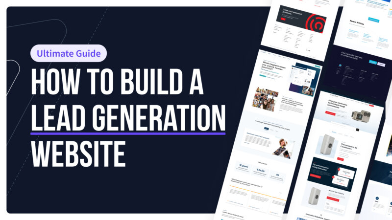
Website Design: 16:9 Aspect Ratios | The Good, the Bad & the Ugly

The Good News
As web designers we have all welcomed the transition from 640×480 to 800×600 and finally to 1024×768 – the currently accepted web design “standard”. The extra horizontal and vertical space has allowed more content to be placed “above the fold”. Designs have gotten more sophisticated and images have been made much larger.

Also, as LCD monitors have taken over the marketplace, display resolutions have been pushed higher with “widescreen” WSXGA+ and WUXGA displays boasting resolutions of 1680 x1050 and 1920 x 1200 pixels respectively. These higher display settings allow even more content to been seen by the user without scrolling.

As a design firm, our anticipation was that the evolution of the LCD monitor would eventually allow us to design for more vertical space. Newer laptops were coming out with displays at 1440 x 900 pixels deep. More design freedom, more use of white space and less worry cramming content above the fold was a dream come true. But not so fast…

The Bad News
Enter HD TV and the popularity of video entertainment being played on the PC. Widescreen now rules and not just ordinary widescreen, but true HD widescreen.

What does this mean for computer users? According to David Hsieh, Vice President of DisplaySearch, “In the near future, panel makers will take necessary phase-out tactics on the existing 16:10 LCD panels in order to drive the market to 16:9 panels. Panel makers did it for square panels, and they know how to do it again”.

DisplaySearch projects that by 2012, 16:9 penetration will reach 90% of notebook PC panels and 67% of LCD monitor panels, as shown below:

Forecast of 16:9 Panel Penetration in the Notebook PC (Left) and LCD Monitor Markets (Right)

The Ugly Truth
OK, so computer makers are going to standardize on monitor aspect ratios from the original 4:3 and 16:10 widescreen to HD widescreen at 16:9. What’s the problem?

The problem is that we are going to LOSE valuable real estate to work with. Instead of 16:10 now we have 16:9 – lots of horizontal space but much less vertical space. On my last trip to Best Buy ALL of the laptops offered for sale were a 16:9 aspect ratio and many of them were running at 1366 x 768 on a 15.6” display. Thus we just lost 132 pixels from the older 16:10 models running at 1440 x 900.

Unfortunately, due to well documented statistics on human preference for reading shorter versus longer lines of text, I’m not sure if we are going to find a way to use the extra horizontal space effectively. So as designers we must again continue to cram important content above the fold and as users we must scroll, scroll and scroll some more to view the entire page.

January 4, 2010 @ 3:52 pm Posted By: Charles Metter

One Response to “Website Design: 16:9 Aspect Ratios | The Good, the Bad & the Ugly”

Leave a Reply

You must be logged in to post a comment.